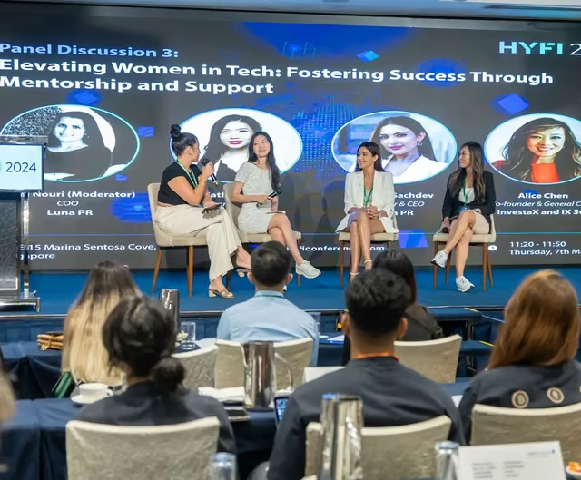
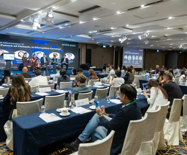
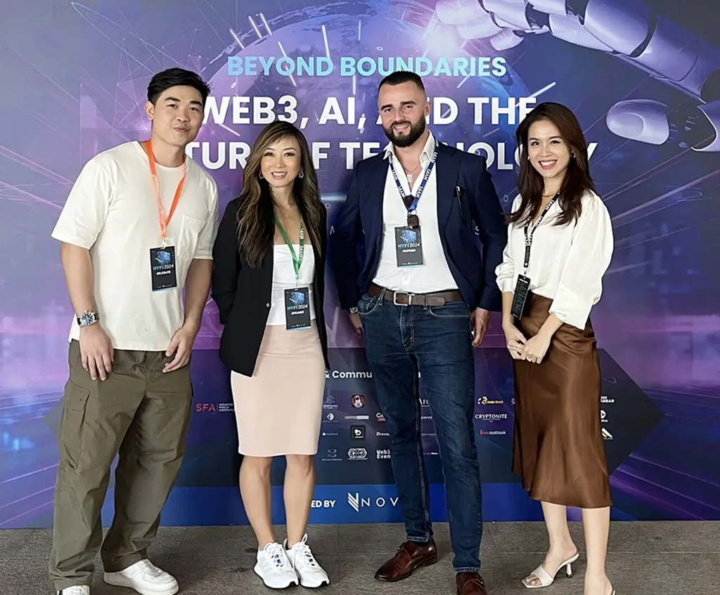
Designing one visual language for an event experienced across hundreds of touchpoints.
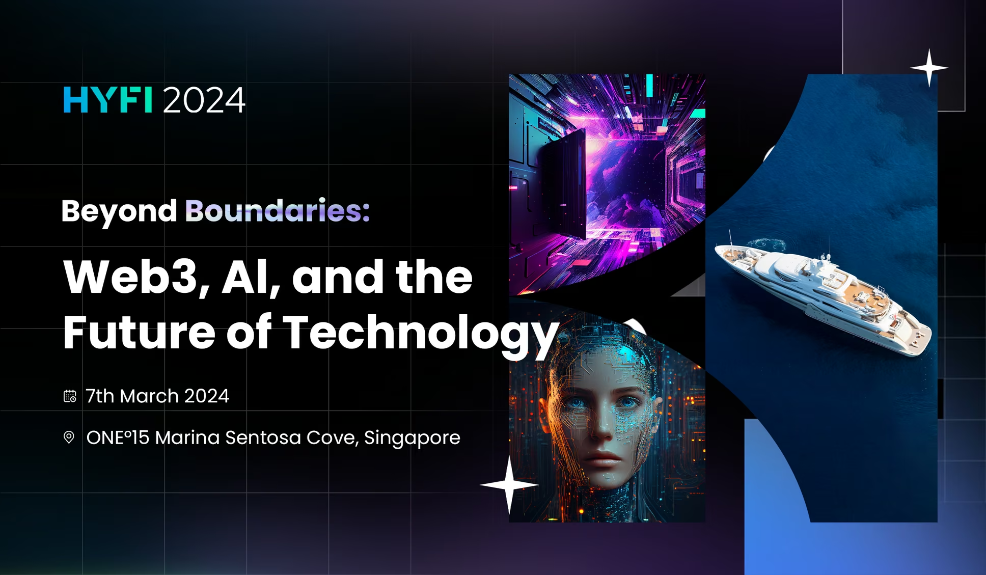
HYFI 2024 brought together leaders across AI, Web3, fintech, and emerging technologies for a premium conference in Singapore.
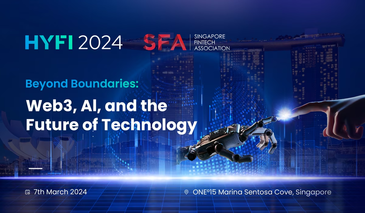
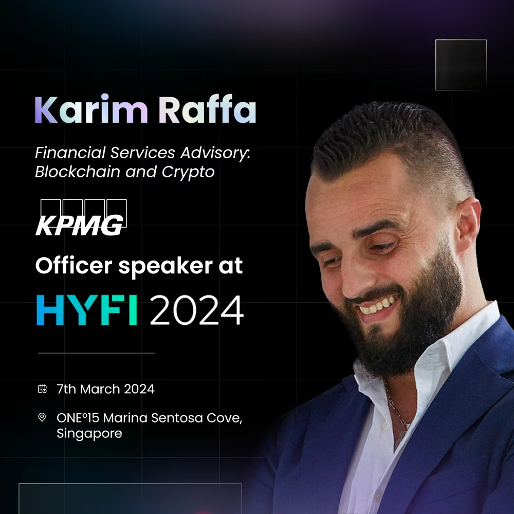
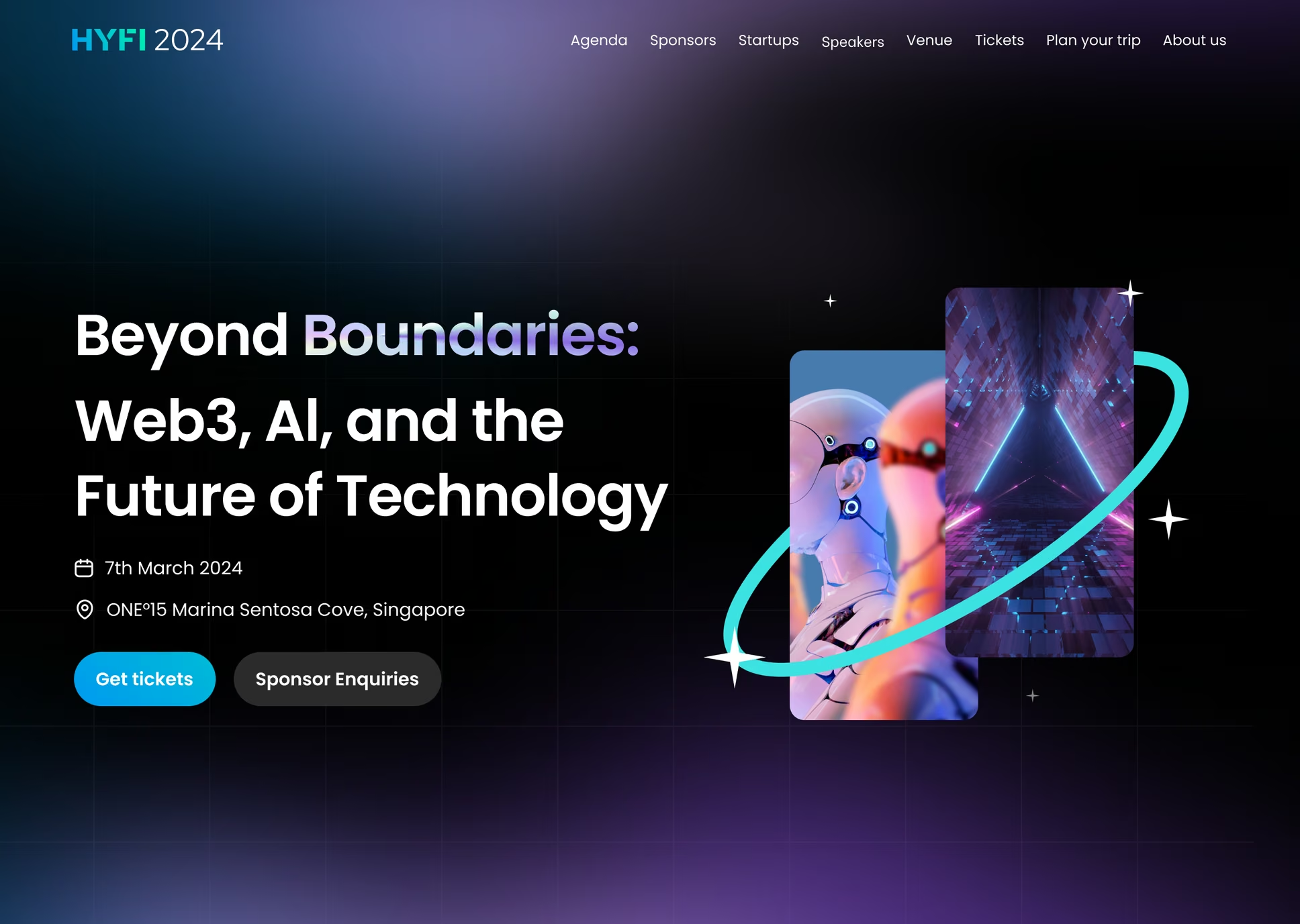
Rather than designing standalone marketing assets, the project focused on building a visual identity that could scale consistently across every interaction from landing pages and keynote presentations to stage screens, motion graphics, social campaigns, and printed materials.
- Role
- Visual Designer
- Timeline
- 2 months
- Tools
- Figma, Illustrator, Photoshop
- Scope
- Identity system, event campaign
Overview
Great events aren't remembered by individual visuals.
They're remembered as one cohesive experience.
Behind every keynote, social post, and stage animation is a visual system that connects everything together.
The goal was to create a design language that communicated innovation while remaining clear, premium, and recognizable across every touchpoint.
One visual system. Hundreds of connected touchpoints.
The Challenge
Every deliverable looked different.
- Every experience needed to feel the same.
- Unlike digital products, conferences launch only once.
- There are no iterations after attendees arrive.
- Throughout the project, speakers changed, sponsors evolved, schedules shifted, and new marketing assets were continuously requested. The challenge wasn't producing graphics quickly, it was maintaining a consistent identity while everything else continued to change.
Constraints
Continuous updates
Content evolved until the final days before launch.
Multiple formats
Digital, print, presentation, stage, and social media all required different specifications.
Premium expectations
The identity needed to balance innovation with professionalism for an executive audience.
Design Strategy
Design the system before designing the assets.
Instead of treating every deliverable as a separate project, the focus shifted toward reusable design foundations.
By defining visual rules early, each asset inherited the same structure, rhythm, and personality. This made production faster while keeping the experience consistent.
Design Principles
Create once. Reuse everywhere.
Shared layouts and components reduced repetitive decisions.
Build recognizable visual anchors.
Gradients, geometric compositions, and illustration styles established immediate brand recognition.
Design for change.
Flexible layouts made last-minute content updates possible without compromising quality.
Visual Language
Modern technology doesn't have to feel complicated.
Many technology events rely on dense interfaces and futuristic effects to communicate innovation. HYFI took a different direction.
Bold gradients, generous whitespace, strong typography, and structured layouts created a contemporary identity without overwhelming the audience.
Color
Electric Blue, Deep Indigo, and Digital Purple create energy while reinforcing trust and sophistication.
Typography
Large headlines establish confidence, while restrained body text keeps information easy to scan.
Layout
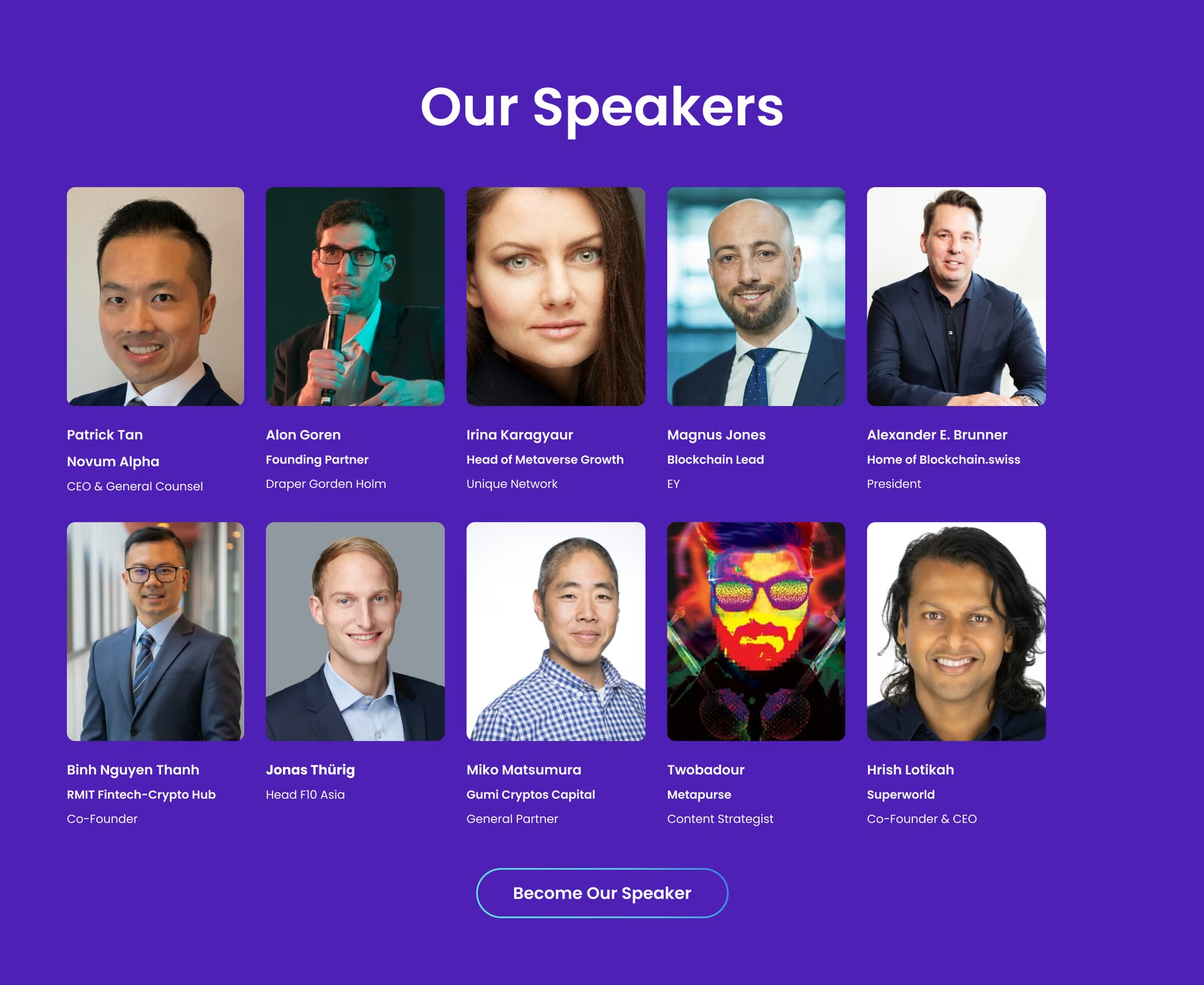
A modular grid system allows every asset to adapt across different formats while maintaining visual consistency.
Design Execution
One system expanded across every touchpoint.
The visual language scaled naturally throughout the entire conference experience, supporting both digital and physical environments without losing consistency.
Deliverables
- Event Identity
- Landing Page
- Keynote Presentation
- Stage Screens
- Motion Graphics
- Social Media Campaign
- Speaker Assets
- Sponsor Materials
- Print Collateral
- Event Signage
Final Outcome
One conference. One recognizable brand.
The final identity unified every stage of HYFI, from early marketing campaigns to the live event experience.
Because the system emphasized reusable foundations, new deliverables could be produced quickly while maintaining a consistent visual language.
The project demonstrated how design systems can extend beyond digital products to shape large-scale brand experiences.
Reflection
Consistency begins long before the final design.
Before HYFI, branding often felt like creating individual visuals. This project shifted that perspective.
The strongest brands aren't built by making every asset unique. They're built by defining a system that allows every asset to feel connected.
When the foundation is strong, consistency becomes a natural outcome rather than a final review process.
Key Learnings
Systems scale creativity.
Reusable design foundations reduce repetitive work and create space for better creative decisions.
Constraints improve clarity.
Tight timelines forced every design decision to become simpler, more intentional, and easier to maintain.
Consistency builds trust.
People rarely remember every individual visual. They remember whether the entire experience felt coherent.